Before you begin
Decide where the result will be used. Keep the rectangular original for the website. A ready-made image with transparent corners needs an alpha-capable format.
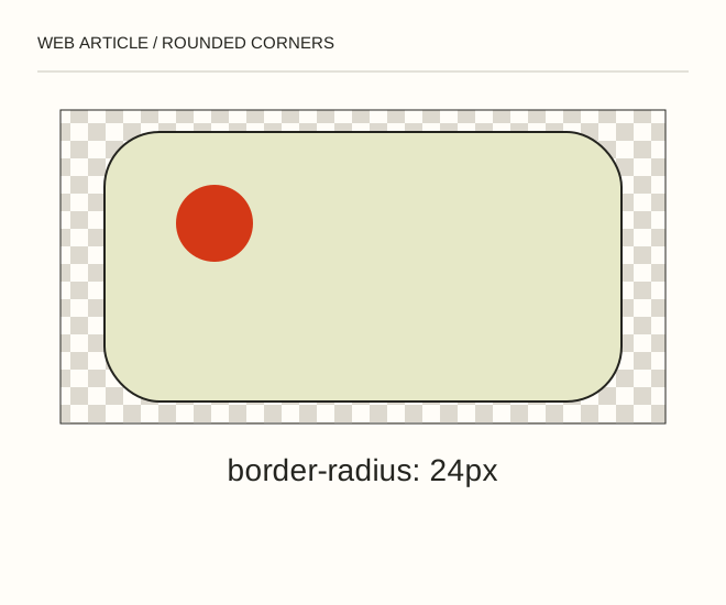
Text explanation of the diagram
CSS for pages → Mask for files → Alpha for corners. An 800 × 600 image can receive a 24 CSS-pixel radius with one declaration. On mobile the radius remains 24 CSS pixels; it does not automatically scale with the original image pixels.
The procedure
- Set border-radius on the image or its container. Use overflow: hidden when the container must clip it, and check that controls or focus indicators are not accidentally clipped.
- In an editor, use a vector mask with a rounded rectangle. Avoid erasing corners destructively because changing the radius later becomes harder.
- Inspect the radius on a narrow screen. Export transparent corners as PNG or suitable WebP rather than JPEG.
.photo { max-width: 100%; height: auto; border-radius: 24px; }A worked example
An 800 × 600 image can receive a 24 CSS-pixel radius with one declaration. On mobile the radius remains 24 CSS pixels; it does not automatically scale with the original image pixels.
Check the result
The real page background shows through the corners instead of white triangles. Nested card and image radii do not create mismatched double rounding.
A common mistake
White corners baked into JPEG only look correct on white. A coloured page exposes the unwanted border.
Sources and next steps
- MDN — border-radius
- Делаем закругленные углы картинок в Фотошопе — 2010-02-06 (RU)
Diagram and examples: Web Article editorial team. The diagram explains a principle; it is not an interface capture or a software test result.