Before you begin
Provide real width/height and useful alt text. Check the unstyled document order first: image and explanation should follow a logical sequence.
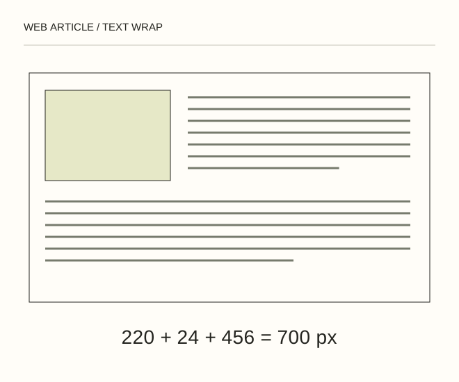
Text explanation of the diagram
Wide: float → Wrapper: flow-root → Phone: separate block. A 220 px illustration plus a 24 px gap leaves 456 px for text inside a 700 px column. On a 360 px screen this becomes too narrow, so the image should occupy its own block.
The procedure
- On wide layouts, apply float: left, a limited width and right/bottom margins. Do not let the image become wider than the text container.
- Give the wrapper display: flow-root so the float does not spill into the next section. Remove the float on narrow screens and let the image use available width.
- Test a short paragraph, a long heading and enlarged text. The next section should not unexpectedly sit beside the image.
.story { display: flow-root; }
.story img { float: left; width: 220px; max-width: 100%; margin: 0 24px 16px 0; }
@media (max-width: 600px) { .story img { float: none; margin: 0 0 16px; } }
A worked example
A 220 px illustration plus a 24 px gap leaves 456 px for text inside a 700 px column. On a 360 px screen this becomes too narrow, so the image should occupy its own block.
Check the result
There are no one-word text strips, horizontal scrolling or collisions with the next heading. Keyboard and unstyled reading order remains logical.
A common mistake
A fixed image width plus large margins can exceed the viewport. max-width does not automatically remove external spacing.
Sources and next steps
- MDN — float
- Как окружить фото текстом и задать отступы текста от картинки — 2009-12-26 (RU)
Diagram and examples: Web Article editorial team. The diagram explains a principle; it is not an interface capture or a software test result.