Before you begin
Use a real long article containing a table, list and image. A short placeholder heading will not reveal genuine content problems.
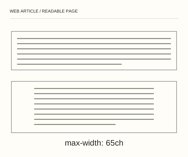
Text explanation of the diagram
Meaningful structure → Comfortable measure → Contrast and zoom. A 65ch column does not guarantee exactly 65 letters per line: the unit follows the chosen font’s zero glyph. It is a testing starting point, not a universal rule.
The procedure
- Limit the reading column, with 65ch as a possible starting point. Choose type size and line height, then inspect real Russian, Ukrainian and English passages.
- Organise by tasks. Headings describe answers; lists communicate sequence or choice. Links should remain identifiable without mouse hover.
- Test at 360 px, on a wide screen and at 200% zoom. Retain table headers and provide usable narrow-screen reading rather than shrinking every cell to microscopic text.
.prose { max-width: 65ch; font-size: 1.125rem; line-height: 1.7; }
.prose a { text-decoration: underline; text-underline-offset: .2em; }
A worked example
A 65ch column does not guarantee exactly 65 letters per line: the unit follows the chosen font’s zero glyph. It is a testing starting point, not a universal rule.
Check the result
No words are clipped, letters do not collide and focus remains visible. Check contrast for body text, links and secondary captions.
A common mistake
A pale caption can technically exist while being impractical to read. Inspect computed colours and their contrast ratio.
Sources and next steps
- W3C — Contrast Minimum
- Как улучшить читабельность текстов на своем сайте? — 2016-02-25 (RU)
Diagram and examples: Web Article editorial team. The diagram explains a principle; it is not an interface capture or a software test result.